Admin Panel Overview Documentation
Introduction
This documentation explains the structure and behavior of the Admin Panel interface from top to bottom. It is designed for both technical and non-technical users, so you can understand:
- what each area of the interface does,
- why it exists from a UX perspective,
- how users should interact with it for daily operations.
The panel uses a consistent layout pattern across modules (categories, devices, rewards, and similar sections), which reduces learning time and makes navigation predictable.
Global Layout
The Admin Panel uses two persistent global regions:
- Sidebar (left navigation) for module switching.
- Header (top bar) for global search, account actions, and quick system controls.
These two regions remain visible across pages so users can move between sections without losing context.
Header
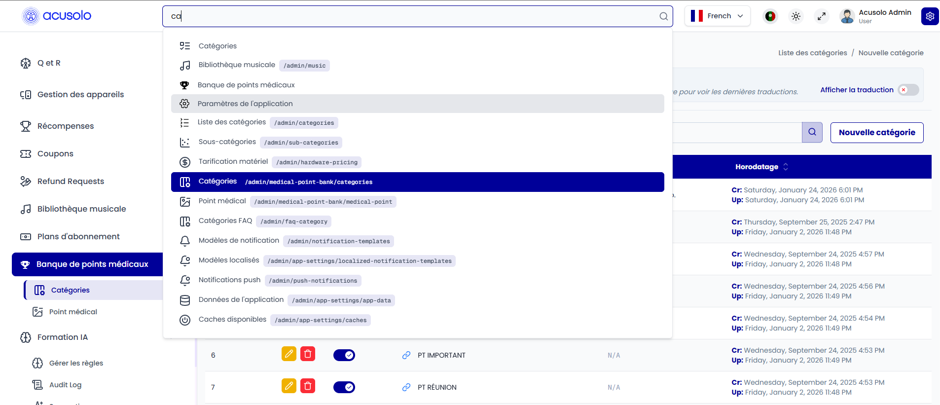
Global Search Bar
The header includes a global search bar that allows users to quickly locate menus and pages.
Purpose (UX):
- reduces click depth,
- helps power users navigate faster,
- improves discoverability of less frequently used pages.
Profile Section (Top-Right)
The profile area shows:
- user name,
- profile image,
- role.
It also provides a dropdown menu that includes Logout.
Purpose (UX):
- confirms who is signed in,
- surfaces role awareness for permission-sensitive workflows,
- keeps account/session actions in one predictable place.
Additional Header Controls
Depending on environment/setup, the header may also include:
- fullscreen toggle,
- theme/settings icons.
Purpose (UX):
- fullscreen supports focus during data-heavy tasks,
- theme/settings improve usability and personalization.
Sidebar
The sidebar is always visible and contains module navigation entries such as categories, devices, rewards, and other admin areas.
Behavior
- selecting an item switches to its module/page,
- active menu state indicates current location,
- grouping keeps related features together.
Purpose (UX):
- creates a stable navigation backbone,
- prevents disorientation when moving between modules,
- supports scalable information architecture as modules grow.
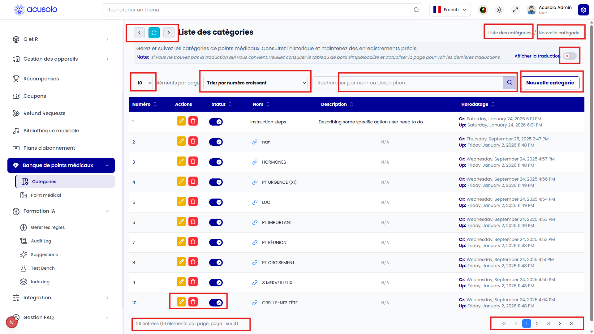
Page Structure
Each content page follows the same pattern to keep user behavior consistent.
1) Top Action Bar
Contains:
- Back, Refresh, and Forward controls,
- a large Page Title,
- right-side Breadcrumbs and Quick Action Menu.
Purpose (UX):
- back/forward supports navigation history flows,
- refresh supports instant data revalidation,
- title and breadcrumb together answer "where am I?" and "how did I get here?",
- quick actions reduce time-to-task for common operations.
2) Summary Section
A short page description explains what this page manages.
Purpose (UX):
- provides immediate context before any action is taken,
- reduces user error in similar-looking modules.
3) Toggle + Description Section
Contains:
- a toggle control,
- nearby text describing what turning it on/off does.
Typical usage: enabling/disabling a module behavior or setting.
Purpose (UX):
- keeps state controls explicit,
- pairs control and explanation to reduce ambiguity,
- supports safer configuration decisions.
4) Description Editor Behavior
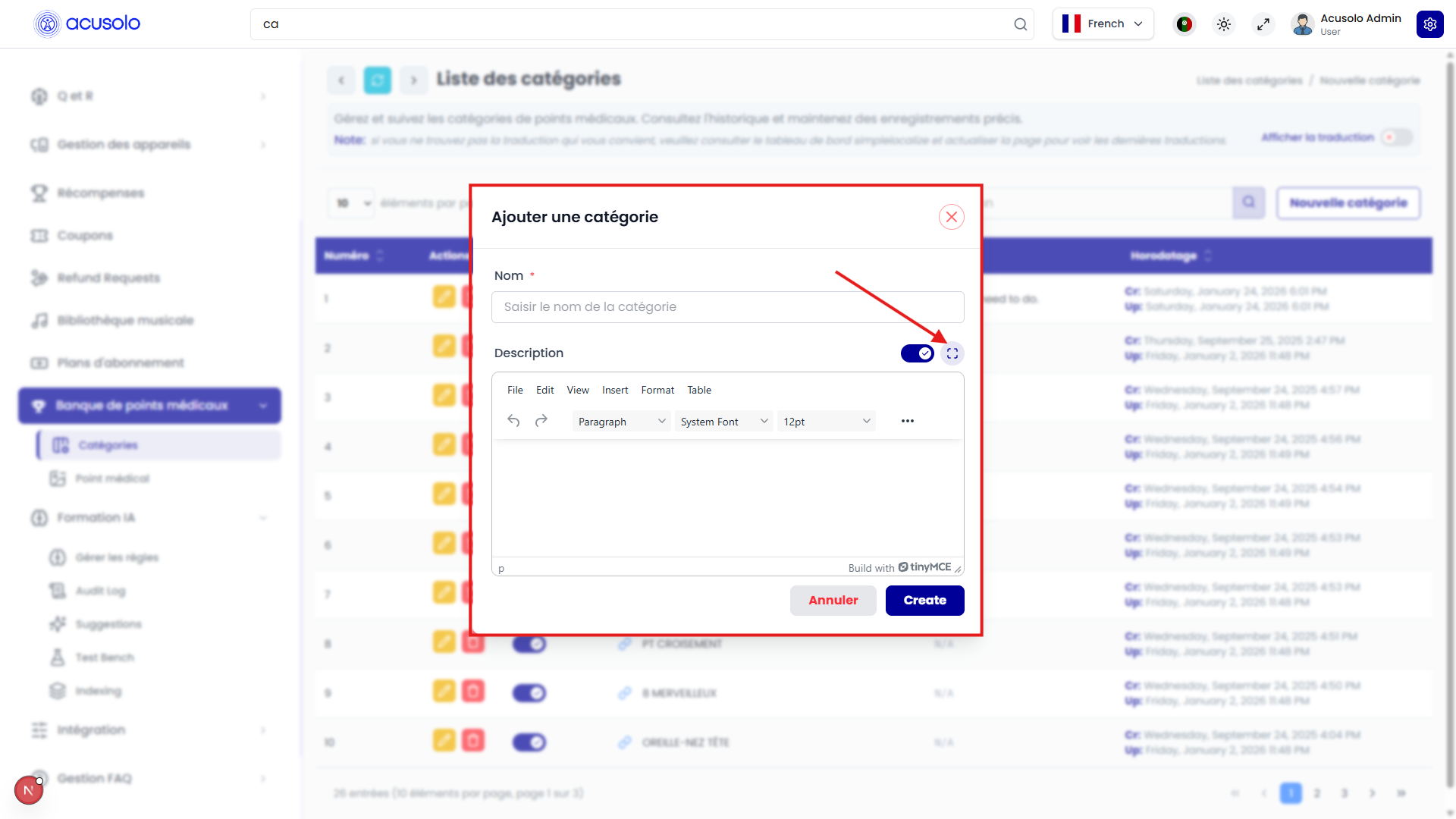
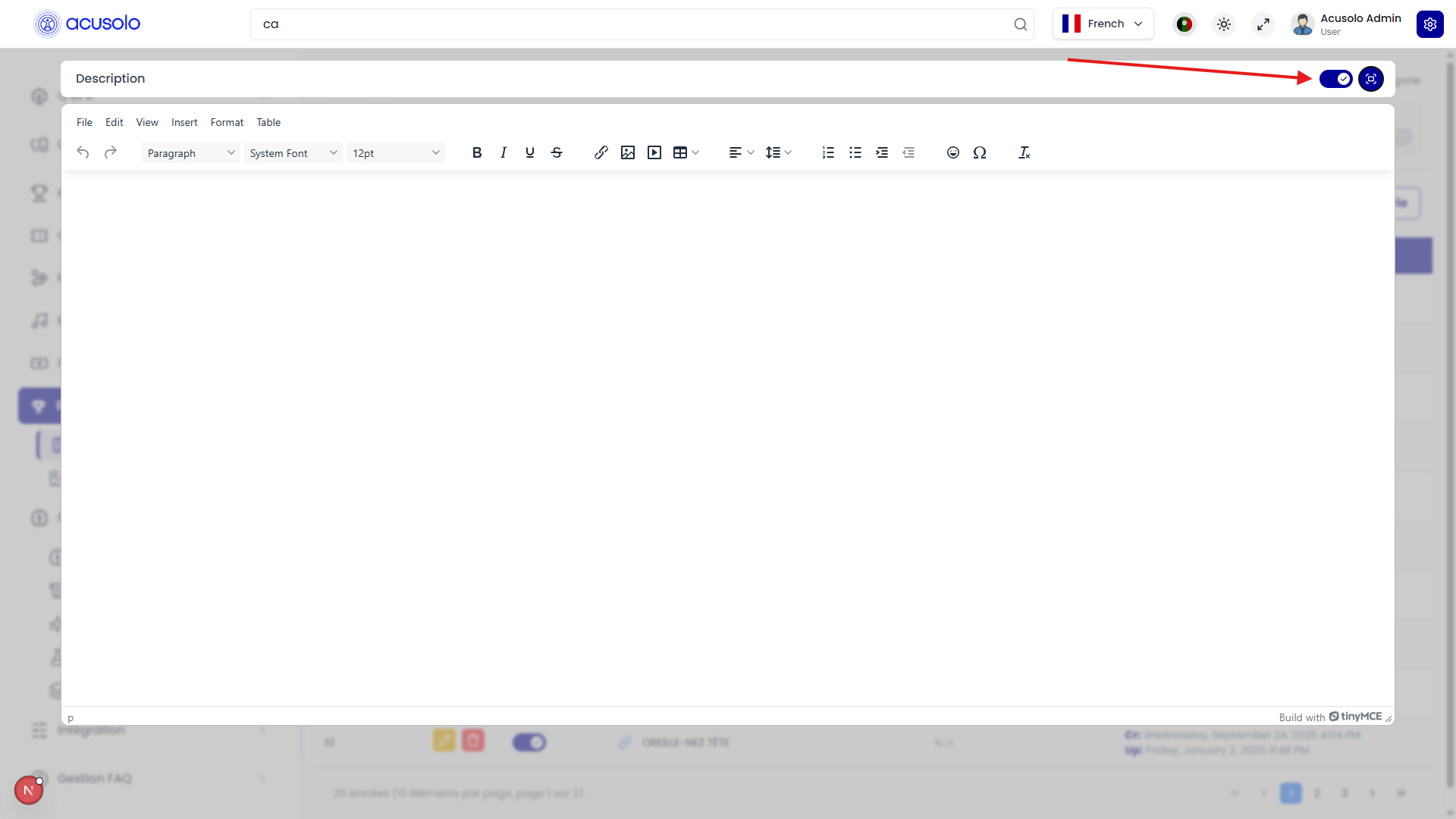
The description editor supports two editing modes controlled by buttons near the editor toolbar:
- Maximize/Minimize button: when clicked after selecting the editor, it expands the editor to a wider fullscreen-style mode for easier writing and reviewing long content.
- Click again to minimize: clicking the same button again exits wider mode and returns the editor to its previous embedded size/state.
- Left toggle button (next to maximize/minimize): switches the editor into a normal textarea-style input mode where rich text customization tools are hidden.
In textarea mode, formatting toolbars are not visible. This is useful when users want direct source editing.
Raw HTML Support
In the plain textarea/source-focused mode, users can copy and paste raw HTML. This helps render predesigned content blocks without rebuilding them manually in the rich editor controls.
Purpose (UX):
- fullscreen editing improves focus and reduces visual crowding,
- toggleable source-style mode supports advanced users and migration workflows,
- raw HTML paste speeds up documentation reuse and template-based publishing.
5) Image input & image editor
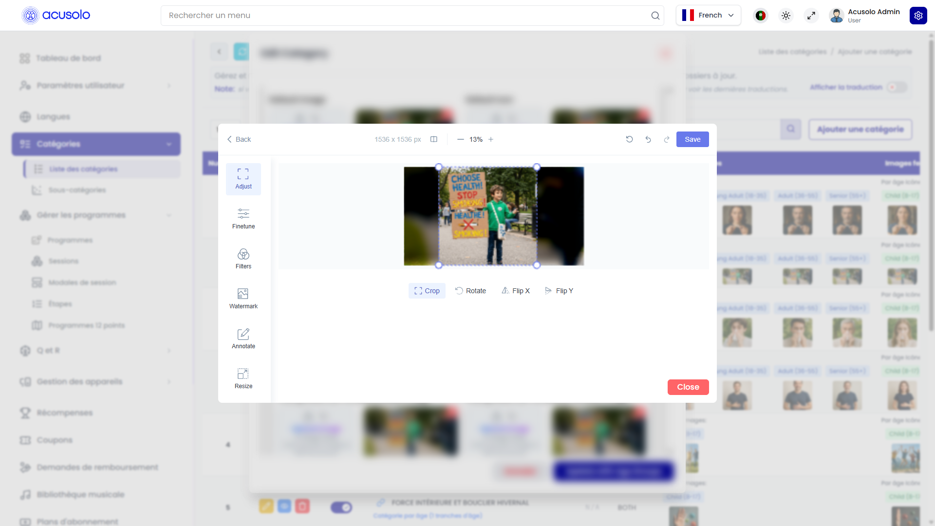
Across the admin panel, every image input field uses the same image editor experience shown above. You are not limited to picking a file only—you can open a dedicated editor to adjust the image before it is saved with the form.
Where this applies
Any control that shows an image preview for an upload (program thumbnails, category images, session modal hero images, icons rendered from files, and similar) follows the same pattern: upload or replace file → optional open editor from preview → save the parent form (Create / Update / Save, depending on the screen).
How to open the editor
- Click the preview image (the thumbnail or preview for that field). That opens the image editor so you can work on the asset in context without a separate “Edit image” menu elsewhere.
- If the field is empty, use Choose file / drag-and-drop first; after a file is attached, a preview appears and clicking that preview opens the editor the same way.
What you can do inside the editor
Use the tools shown in the editor UI (your screenshot reflects the live product). In general you can:
- Crop and frame the image so important content is centered for cards, heroes, and list thumbnails.
- Adjust brightness, contrast, or other controls if the editor exposes them (exact controls depend on the build).
- Convert to WebP when the product offers that option: WebP usually reduces file size compared with PNG/JPEG at similar visual quality, which helps faster loads on mobile and web. After conversion, confirm or apply inside the editor (wording may vary), then save the modal or page so the server stores the final asset.
Recommended workflow (step by step)
- Open the create or edit form (program, category, session modal, etc.).
- Upload an image or keep the existing one.
- Click the preview to open the image editor.
- Crop or adjust until the preview matches how it should appear in the app.
- If you want a lighter file for production, convert to WebP and confirm in the editor.
- Close the editor (Save / Done / X per UI), then submit the parent form with Create or Update (or equivalent).
Skipping step 6 leaves changes only in memory until the record is saved.
WebP: when it helps
- Hero and large banners: biggest win for bytes saved and perceived speed.
- Many small thumbnails: still useful if you have a large list of programs or categories.
- Already optimized assets: if the source is already small WebP, reconverting may add little benefit; focus on composition instead.
If a downstream channel requires a specific format (for example strict JPEG only), follow your team’s publishing rules; the editor’s WebP option is for the common case where WebP is supported in the web app.
If something looks wrong after save
- Hard refresh the web app (cache may show an old image URL).
- Re-open the record in admin and confirm the preview matches what you exported from the editor.
- Confirm you clicked Update on the form after closing the editor.
Purpose (UX):
- one consistent pattern for all image fields (icons, banners, gallery items, and so on),
- preview is the main affordance: click preview → edit, which matches how people already think about “changing this picture,”
- WebP support keeps media optimized without needing external desktop tools for every upload.
Table & Data Management
The data table is the main workspace for records.
Controls Above the Table
- Records per page selector (dropdown): controls page size.
- Search input: filters records.
- Add New button: opens record creation flow.
Purpose (UX):
- page-size control supports both quick scans and dense review,
- search reduces manual browsing effort,
- Add New keeps creation action prominent and predictable.
Table Structure
The table includes:
- column headers for field meaning,
- row-based records for each entity.
Each row includes action controls:
- Edit,
- Delete,
- Status Toggle.
Row Translation Preview (SimpleLocalize)
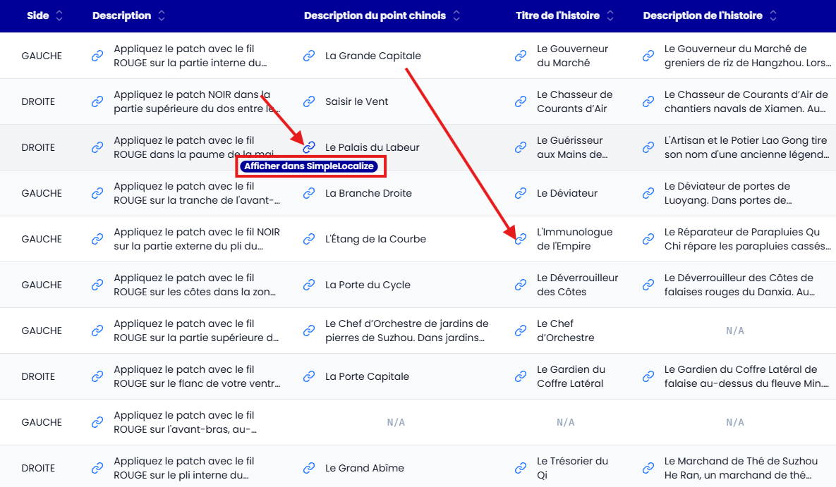
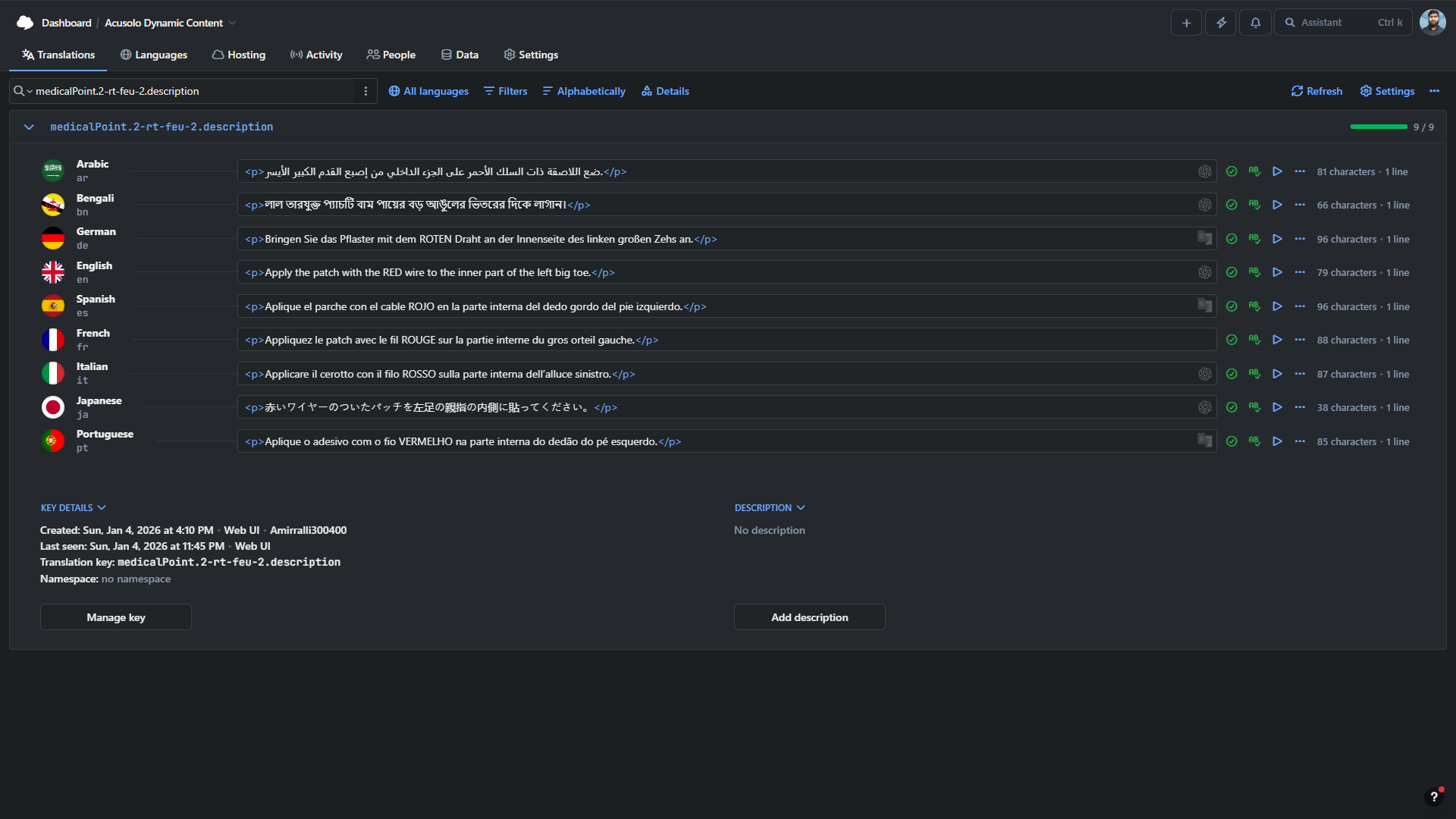
In each text row, the link-style icon button on the left acts as a Preview button for SimpleLocalize.
When clicked, it opens the related translation item preview so users can verify content across all supported languages from the SimpleLocalize dashboard view.
This helps teams validate:
- translation completeness per language,
- wording consistency across locales,
- how the text appears before final publishing.
Purpose (UX):
- provides quick translation QA without leaving row context,
- reduces translation mistakes in multilingual releases,
- speeds up review by connecting admin rows directly to localization preview.
Actions & Controls
Edit
Updates an existing record's data.
Purpose (UX):
- supports correction and maintenance without duplication.
Delete
Removes a record from the system (typically with confirmation in standard UI patterns).
Purpose (UX):
- allows cleanup of invalid or obsolete entries.
Status Toggle (Critical Behavior)
The status toggle enables/disables a record.
When disabled:
- the record is hidden from the main WEB APP UI,
- the record remains manageable in the admin panel.
This is useful for:
- temporary visibility control,
- scheduled publishing/unpublishing behavior,
- safe operational testing before public exposure.
Purpose (UX):
- gives fine-grained visibility control,
- avoids permanent deletion for reversible changes.
Pagination & Navigation
Below the table, the interface provides:
Table Footer / Overview
Displays summary information such as:
- total records,
- current page,
- current visible item range.
Purpose (UX):
- keeps users aware of dataset size and scope,
- confirms that filtering/paging actions took effect.
Pagination Controls
Supports movement through records using:
- First page,
- Previous page,
- Numbered pages (1, 2, 3...),
- Next page,
- Last page.
Purpose (UX):
- enables fast traversal for both small and large datasets,
- balances speed (first/last) and precision (numbered pages).
End-to-End User Flow (Recommended)
- Use Sidebar to open a module.
- Confirm location with Page Title + Breadcrumb.
- Read Summary for scope/context.
- Use Search / Records per page to narrow data.
- Perform row-level actions (Edit/Delete/Status).
- Review Footer + Pagination to continue browsing.
This sequence keeps operations clear, auditable, and efficient across all modules.